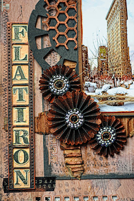
To keep in the chipboard theme, I used 2 pieces of Kraft paper to complete this layout. Gesso, paint, stamping and embossing round it all out in techniques. I even used some washi tape!! And I channeled my very talented friend Heather Jacob while I was creating this layout. you can see so many beautiful Heather touches here. I absolutely love her style and thought it was perfect for this layout!.
The Manor Hinge was painted with black acrylic paint then kissed with Viva Colour Metallic rub in Copper. I used the rub on the nailhead brads as well.
I used a piece from the Film Strips pack to display the title of my layout. The Bits Of Honey pieces were rubbed with the bronze metallic rub as well. They look like actual metal pieces.The Rosettes were die cut from my Tim Holtz Alterations Die. I rubbed the edges with The Viva Colour Bronzze Metallic rub before accordian folding and putting together.
I die cut some Tim Holtz Alterations tags and then used an embossing folder to make them look like they were cut from scrap metal. I used distress stain on them and lightly touched the edges and raised parts with black distress paint.
Here is a closeup of the magnificent building. And if you have never heard of it, read about it HERE. Fascinating... I used the Tim Holtz Alterations Pediments die to top the photo.
This next project is another entry into my art journal. I think the Winter Page Dangles fit perfectly in my journal as they were the perfect size. I followed the sketch from our January Sketch Challenge. I hope you join in and create something with the sketch.
The Blue Fern Studios Shabby Snowflakes were coated with Glitter then topped with a pink rhinestone to enhance the color of the rose in the photo. It adds just a touch of warmth.
The Winter Page Dangles were painted and then covered with a thick Lacquer medium and sprinkled with glitter. The lacquer is dimensional makes them look like jewels. Rhinestones were also attached to the page dangles.
This last layout is a redo of an older layout I had stashed in my pile of layouts. Long ago, I had created some rolled roses for this page and attached some store bought butterflies. It needed a serious wonderful new facelift, so I pulled off the flowers and butterflies, picked out my Blue Fern Studios chipboard and created my redo. I love it even better than the old version. It is bright and cheery and makes me think of a summer garden.
The Fantasy Butterfly set has the most beautiful pattern in the wings. Open and lacy and perfect for this frilly page. I used a Splash Of color Viva Colour Pearl Pen in Black for the body and antennae, then painted the wings with acrylic paint in white, and spread Silks Acrylic Glaze in Plumeria over that when it dried and sprinkled some iridescent glitter on while the glaze was still wet. The photo needed some corner adornments so I used 2 of the Small Symphony corners that I painted with Splash of Color Luminarte Acrylic Glaze in Pomegranite and then rubbed Violet Splash Of Color Viva Colour Inka Gold metallic rub on lightly for added shine.
I replaced all of the big flowers on the layout but kept the large brown one underneath.
I just adore the small Symphony Corners. They add an elegant touch to photo's.
Thank you for stopping by for some inspiration. I hope you join our Blue Fern Studios January Sketch Challenge. There is an awesome prize to be won!!! Till next time, Happy New Year!! May the new year bring you wonderful creativity!!


GORGEOUS projects, Lisa!!!
ReplyDeletexErin
Love all the metal look in the first one, the winter is theme is so pretty in the second and your last is just Beautiful!
ReplyDeleteWhat a great idea for older layouts! Gorgeous :)
ReplyDeletePaula
Your pages are beautiful Lisa. I can see Heather in the first...and that is such an awesome building. My DH and I plan to do a road trip through the US within the next few years. The country is so huge that we will have to do our planning very carefully. I love your art journal page too,
ReplyDelete