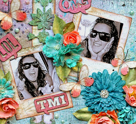
Here is the beautiful October sketch designed by the talented Michele Singh. I hope you will give it a try, join us and enter to win an awesome Blue Fern Studios prize!!
I got a little inky with this layout and used Lindy's Stamp Gang Colors in the same hues that were in the paper. It al blended in so well. I used lots of texture paste, not only on the paper, but also on the diamond shaped chippies. I did some stamping and splattering of a little paint on the background as well
After the texture paint on the diamond shaped chippies was dry, I misted them with Lindys and adhered them to my layout. I saved the diamond shaped chipboard from BFS Harlequin Panel after I punched them out, but you can buy a pack of different "innards" from BFS. They add great texture and character to your projects.
I used a mix of manufacturers flowers for my layout but handmade the leaves.
I cut one of the pieces from the the Double Dutch Flourish Set in half. I added texture paste to it and then misted it with Lindys. I placed it on the banner strip.
Split in half
I really like those Polaroid frames that a couple of companies have out there. But they are hard to find. I really wanted some for this layout. So I made my own..EASY EASY!!! I had to take a trip to Michaels though ( yay!!) to get what I needed most. I bought the Spellbinders Large Squares Nestabilities die set. I cut a wide strip of paper. Offset the square on the strip and ran it through my Vagabond. Then I just cut the strip to the length I wanted to look like a Polaroid frame. I saved the inside square that was cut out, placed my pic on it, trimmed the photo to the square and placed it back in the spot it came from. Or you could just adhere the photo to the back of the frame. I will do a quick tute on this technique that I used to create the frames. I inked the edges softly to give them some depth. Just some closeups of the flowers I used.
The caption chip board is from the This Is My Life chipboard set. They are fun little acronyms! I just sprayed them with Lindy's without priming them. The shimmer is so beautiful.
Thanks for joining me today. Head on over to the Blue Fern Studios October Sketch Challenge and join in for a chance to win a fabulous Blue Fern Studios Prize.
Blue Fern Studios Products used:
Double-Dutch Flourish set
Harlequin Page Panel


beautiful Lisa :)
ReplyDeleteWow, what an amazing page, Lisa!! Love your color and gorgeous dimension!! ~ Blessings, Tracey
ReplyDeleteGarden of Grace
Lisa this is a very fun and colorful page.. TFS On another note I lost you on my fb page. Now when I look you up on FB it says that your page cannot be found. Maybe there is a problem with the link on your blog also. When I click on the blog link to your fb it says the link is broken. I miss you posts and the beautiful art work you post on your fb. Hope I can get back on your friends list..lol xxx Leida
ReplyDeleteThis looks amazing, what stunning texture and back ground details!!
ReplyDeletevery cute and fun layout, love those colors!
ReplyDeletewow I am loving this layout the colours are so fun and every little bit of texture is so fascinating I keep looking and finding more treasures love it all
ReplyDeleteAbsolutely beautiful layout! I love the design and the Polaroid frames that you made! I love the texture and the painting! Absolutely beautiful! I'm definitely going to have to find some texture paste...not sure I've ever seen that!
ReplyDeleteLisa, what a stunning mixed media layout. Gorgeous!
ReplyDelete