Monday, August 29, 2016

Yvonne Blairs Art Girls Design Team. Believe in Yourslf.

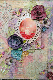
The power of positive thinking is a wonderful thing. I often think of the story The Little Train That Could. So strong, so determined...So magical. It goes to show, that if you believe in yourself, the magic WILL happen. You just have to believe... I created a 12x12 layout to showcase the photo of my granddaughter. I altered the photo to make her appear as if she were a fairy among glowing fireflies deep in a forest. I started by mounting my Prima papers onto a piece of 12x12 corrugated cardboard using ModPodge. Then I dry brushed a very light coat of white and clear gesso all over the background. This gave me a base similar to a piece of canvas.


I just knew the Yvonne Blair Design Stamp "Believe in Yourself" was perfect for this layout.
My one weakness in creating layouts, is the title or journaling. Yvonne's wonderful stamps eliminates  that problem for me. I just pick a stamp, and go with it. Title or journaling done. 


 I painted a piece of cream card stock with Prima Art Alchemy paint for shimmer. Then I stamped the quote onto the painted card stock using black ink, and cut each word out. I used the black ink on the edges of each word and mounted them onto my layout.


 I layered some painted Dusty Attic chipboard, a painted Sizzix diecut frame, Prima flowers, diecut leaves and butterflies on the background. They were all colored with Prima Color Bloom sprays and Alchemy paints. Once my composition was done, I added Prima Art Stones in 3D Gel and using a spatula, added them randomly around the layout. Once it was dry, I sprayed them and the background with Prima Color Bloom 2 sprays in Pink Crocus and Black Tulip.


 To get a runny watercolor look, I sprayed the layout with some water, then Color Bloom sprays right over it and let the colors run and settle in the stones.


Just a close up of the water color look you can achieve, by spraying your primed papers with a fine mist of water, then your color sprays right over that immediately and let the colors run.


Dusty Attic has the most fabulous chipboard designs. This one is Damask#2. After priming them with white gesso, I used Prima's Violet Green Art Alchemy paint over them. I used 2 of them on this layout.


Thank you for joining me this week and letting me share the details to my creation.


Products used:
Impression Obsession Yvonne Blair design stamp:


Prima Marketing:
paper
Art Stones
 Alchemy Paint
flowers
 3D Gel medium
 Clear Gesso
 white gesso
 die (leaves)
 Color Bloom sprays

Sizzix Die cut frame
Recollections Flowers
Dusty Attic chipboard
butterflies


Gilding the Lily...MoodBoard Inspiration Lisa Gregory

 Hello Dusty Attic Lovers, Lisa here with  a mixed media piece here for your inspiration. This one is based on the August Mood Board. Green, Blue, Pink, with a touch of gold...OK..LOTS of gold.
For this layout, I white washed a piece of 12x12 patterned paper that I mounted on a piece of 12x12 corrugated cardboard. Then I used a mask and modeling paste in random spots. I coated all of my chipboard with white gesso. I coated the flowers with clear gesso. To frame my photo, I used a resin frame that I found at Hobby Lobby in the bridal section, and I coated it with white gesso as well. I tore and peeled back a piece of the background paper to reveal the corrugated card board underneath. I placed the frame and all of the elements on my paper. I pulled out my colored sprays and this is where the magic began to bring out the beauty in the Dusty Attic chipboard and flowers.


I absolutely love the Pendants chipboard, They are so elegant, This one has sweet little birdies in the framed circle. I cut down some pieces of the chain and used the pieces on either side of the pendant and "hung" some Foliage leaves on them. I placed a few strategically placed Prima Art Pebbles on the hanging Foliage and the pendant. They were brushed with gesso before spraying with Lindys's Stamp Gang spray color and dry brushing some Art Alchemy paint over them.


I tucked the Foliage chipboard under the Dusty in Bloom flowers . You can see a closeup of the Prima Art Stones. I added globs of Prima 3D Gloos gel where I wanted to adhere the stones. Once they dried, I brushed them with gesso, then used colored sprays over them before dry brushing them with Rose Gold Alchemy paint.


The Little Moments chipboard was sprayed with a darker plum color to match the original color of the flowers. After it dried, I white washed Art Basics Alchemy paint in Rose Gold over the title.


I sprayed the frame in blue green and purple to blend into the background paper. Then white washed Art Basics Alchemy paint in Rose Gold to give it a gilded antique look. I left a lot of the blue and green for a Patina look as well. I gave the entire layout a light brushing of Rose Gold Alchemy paint. I guess you can say I gilded the layout.


-


Monday, August 1, 2016

Dusty Attic July 2016 MoodBoard

Hello my Dusty Attic Lovers!! One of my favorite parts of Dusty Attic is the Mood Board. It is the perfect platform to kick start your mojo!! Lisa here, to inspire you to grab those gorgeous colors or words and start creating. I started by mounting a piece of edge distressed  patterned paper to the Corrugated cardboard. Then I added another layer on top of that one and popped it up by adding cardboard in between the layers.


All of the chip board was painted with Dusty In Colour Sunburnt Orange. While it was still wet, I dabbed on some Cashmere using my fingertip. Once it dried, I glossed over it with a thick layer of  Dusty in Colour Clear Crackle Varnish. The thicker you apply the varnish the more pronounced your cracks will be.


I only used 1 piece of the Decorative Scroll in the set for my frame. I wanted a light delicate frame. I used Rangers distressed marmalade ink to enhance the papers under the frame to make the design pop. All of the flowers were colored using Lindy's Stamp Gang Sprays.


 Here is a closeup of the Shine title. I did not use the crackle varnish on this piece. You can see the deep crackle in the other pieces.


I also placed cardboard under the framed photo to pop it up for dimension.

I really enjoyed working with this mood board. The colors are so deep and vibrant and I am really partial to orange. It use to be my least favorite color, and now I love it so much, that I even bought a Camaro in Inferno Orange. It is the same deep orange in the Moodboard...Sigh.......♥


Corrugated Cardboard

Dusty in Colour Sunburnt Orange

Dusty In Colour Cashmere