Monday, January 27, 2014

Down By The Sea with a Splash Of Color!!

Hello friends, It's my turn on the Splash Of Color Blog with a layout full of Twinkling H2O's, Silks and Radiant rain. My layout starts with a beautiful piece of "PAINT IT" with Luminarte paper. I randomly covered the paper with gesso in a light coat. When it dried, I used a mask and sprayed Luminarte Radiant Rain Shimmering Mist in Pink Grapefruit. I painted on some LuminArte Twinkling H2O's in Bashful Blue on some parts of the paper. I inked the edges lighty with a brown distress ink. I think I inked the edges of everything in the distress ink to give the whole layout a slightly worn feeling. After looking at my layout and closeups for the debut on the Splash Of Color Blog, I looked closely and felt something was missing. We are soooo critical of ourselves. Well, I thought it was missing some sewing. But it was to late as I couldn't get around the bulky items on my layout. Then I was watching a video from Pop and Colors #2 by Georgia Heald and I remembered my Prima stitching stamps...So I went to town using black ink and my stamps...ahhhh...feels finished now. My friend Carrie let me use a pic of her gorgeous little Stella on the beach...


You can see the shimmer of the Twinkling H20's. For the flowers I usd lots of gorgeous colors. Bashful Blue, Chiffon Pink, Icy Iris, Cherry Sorbet and Sea Glass. For the leaves I used Olive Vine. I created small rolled paper roses and sprayed them with LuminArte Shimmering Mist in Pink Grapefruit. I dropped a small pearl in the middle of some of them.  I flicked some LuminArte Silks Acrylic Glaze in Black Ice on the background paper.


The beautiful mermaid cutout is from an Iron Orchid Designs Die Cut Shapes package created for Creative Imaginations which is now Splash Of Color. The star fish in the photo above is from the same package. I used a Viva Colour Glitter pen in Iridescent Multi Colored to highlight the starfish and the leaves. You can see the chipboard circle peaking out in this photo. It was treated with Viva Colour Crackle Paint Base Coat - Base Coat for Porous Surfaces, and after it dried was painted with Viva Colour ~ White Crackle Paint.
Once the crackle paint was dired and crackled, I painted it with Silks Acrylic Glaze in Pink Grapefruit keeping with the color theme. I love how the LuminArte product colors coordinate with one another.


I took one of the cutouts to use as my title for the layout and used some jute to string through it and turn it into a tag.


I used plain white flowers from different manufacturers and painted them with the Twinkling H20's. The shimmer and shine is amazing. I lightly inked the flowers with brown distress ink. The little film strips are a Washi tape I found. Isn't it wonderful!! I can Thank Limor Webber and Gabe Dehod for getting me addicted to Washi tape!! Gabe is the queen of Washi, and a mad scrapper too!!!


I love some of the cutouts in the IOD die cut pack. I tucked a tiny flower behind Stellas ear.


Here is a closeup of the Blue Fern Studios Graduated Circles chipboard using the technique I described above.


Just a little closeup of the flowers.  I used I Am Roses and Recollections flowers in white and cream.

DSC_2822
Thank you for stopping by today. If you want shimmer and shine on your projects, then LuminArte and Viva Colour have the products and colors for you.Head on over to Splash Of Color and get your Color on!!!

Tuesday, January 21, 2014

BoBunny Blossoms arent just for layouts!!

If you know me, you know how much I adore flowers. So when we were challenged to create something other than a layout or card using  BoBunny Blossoms, I gladly stepped up the the challenge. But what to do... Then I envisioned the blossoms on a headband. I had been inspired by a bunch of them I saw in a Photography studio being used as props. I had to create one of my own.


BoBunny Blossoms are so very versatile. I was inspired by some head bands that were being used as props at a photography studio. I wanted one for myself.


I went through my sewing stash, pulled out some cord elastic, BoBunny Burlap Pleated Lace and a needle and thread. Then I picked out my flowers. I thought the Burlap Pleated Lace would make the perfect base for my headband.

I cut a length of the burlap, attached 2 pieces of elastic cord to the ends and sewed them to the ends of the burlap. I wrapped and hot glued small pieces of burlap over the ends to cover the raw edges. It was a very simple project using the wonderful BoBunny Burlap Pleated Lace and Blossoms.

BoBunny Supplies:
Blossoms: Clover Dahlia
Essentials: Kraft Burlap Pleated Lace

Monday, January 20, 2014

Love is in the air with Splash Of Color

  Valentines Day is coming up and I decided to start a "Love" vertical paper bag mini album as a keepsake for lots of pictures of my husband and I. Once the base of the album was done, it was time to splash it with color!! I had a lot of fun using different elements from Splash Of Color. Luminarte and Viva Colour just make your projects shine. And all of the papers I used are from BoBunny using the Head Over Heels collection. perfect for you Valentines projects.
Here is the cover of my album. It all started with a 12x12 piece  of chipboard that I cut down and created the cover and spine with. Once it was assembled I gathered all of my embellishments. A wooden cage, chipboard, white flowers, ribbons, leaves, charms, and lace. I painted the letters with Silks Acrylic Glaze in Pink Grapefruit. And edged it around the letters as well for a glow.
DSC_2789

I used some seam binding to tie on my trinket that is hanging from the top of the spine. I colored the seam binding by combining Luminarte Radiant Rain Shimmering Mist in Poppy, Persimmon, and Copper. I sprayed them on my non stick craft mat and rubbed the color into the ribbon. I dried it with a craft heat gun and let it wrinkle slightly.
DSC_2776

The spine of the album was embossed using a textured embossing folder and my Sizzix Big Shot. Once the album was assembled the spine was ready for some magic. I sprayed a little water into my pot of Viva Colour Inka Gold Metallic rub in Lava Red, picked it up on my finger and started the process of rubbing it onto the embossed spine just to hit the raised areas the most. Once the rub was dry (it dries immediatly) then I buffed it with a soft cloth. The look is like an old worn vintage leather bound book. Love the effect that the Metallic Rub gave the embossed paper.


DSC_2800

I painted the wooden birdcage with Viva Colour Crackle Paint in black. The white flowers were given a very light spritz of water, then I started the coloring process. I wanted a durable flower so I mixed a little Luminarte Primary Elements in Fuzzy Peach with Viva Colour Crackle Paint in white. I painted the larger layered flowers with my crackle mix. Once it was dry, I added a light spritz of Luminarte Radiant Rain Shimmering Mist in pink Grapefruit. When that dried I rubbed a little Viva Colour Pearl Pen on the ridges of the petals in Red Pearl. And the final touch was rubbing in Viva Colour Inka Gold Metallic Rub in Lava Red. I dropped a half pearl in the middles and surrounded them with Viva Colour German Glitter pen in Red. The depth of the colors in the flowers is just fantastic when bleding all of the product. And mixing the crackle paint in with color as the base gave the flowers a stiff and durable finish. The roses were spritzed with water then painted with Silks Acrylic Glaze in Fuzzy Peach and Pink Grapefruit.
DSC_2798

I hope you enjoyed my process in decorating my mini cover. I will be working on the inner pages as the days go by. I found a wonderful video on YouTube that I followed to construct my mini. Ginger ( My Sisters Scrapper) on Youtube is sooooo talented when creating her mini's. You can GO HERE to start the series for the Vertical Paper Bag  Mini Album.  Then  go and color your world with a Splash Of Color!!! It will surely put a smile on your face and add a  creative touch to your projects!!.

Monday, January 6, 2014

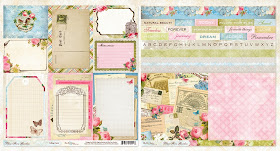
GIVEAWAY: Blue Fern Garden {Our NEW Paper Collection!}


Today is a very exciting day at Blue Fern Studios, because we finally get to reveal to you {in its entirety} our BRAND NEW paper collection:
 Blue Fern Garden
AND we're giving some away- how would you LOVE to win this one for yourself? First take a look at these gorgeous papers, and then scroll down to see how you can make it your OWN!
 
Head on Over to the Blue Fern Studios Blog to see how you can win!!!!


Sunday, January 5, 2014

Guest Designing at My Creative Scrapbook and Reveal Day!!

This month has started as a creative one for me. I had been working on a ton of projects before life was interrupted with my father in law's illness. With family always coming first, I improvised. I packed my tote and scrapped in the hospital so as not to leave his bedside. Only because scrapping is my therapy.
 I am thrilled that Pam invited me to Guest Design for My Creative Scrapbook this month. And to work with the gorgeous January Limited Edition kit is something I have wanted to do for a very long time. I do have 1 more off the page project I have, but that one will have to reveal in a week or so. The only things I added from my own stash to complete my layouts is butterflies, but I will share the files that you can download and use for your projects as well. Other wise the kit stands on it's own in beautiful content.


This first layout was done with just 1 sheet of paper. I stamped, inked and used gesso with the Prima mask in the kit. And dont discount the box your kit  is shipped in, I tore the flaps off and used them here. A little gesso, spray and topped them off with the Prima Say it in Crystals arrows.

  
You can create an instant title with the Heidi Swapp words pack. I used the word Happy.

  The flowers were die cut from a sheet of the paper in the kit and I colored then using Luminarte Silks Acrylic Glaze.
  Dont discount the packaging your flowers and embellies come in either. I crated the frame for my photo with the packaging my flowers came in.

  
Here is a closer look at the frame. I popped a little heart on it.

  
The next layout is one I did of my son and daughter in laws 2 gorgeous huskys. Akira and Khalesi. They are the best of friends. And almost never leave each others side, even though they rescued Khalesi 2 years after they got Akira. They bonded instantly.

 
Here is a close up of the 2 sweet angels. I just used a little distress ink on the DIY Thickers.


Once again I die cut some flowers and mixed them with flowers in the kit.


 Here are the butterflies I used on this layout. They were scanned from an old Websters pages paper I had in my stash. I created a file in Photoshop. So I thought they would be perfect for this kit and the gorgeous new Websters Pages paper in the kit.


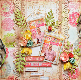
 When I saw the colors in this paper, it reminded me of one of my brothers pictures that went perfectly. He owns a full service design  company in New York City. Creativo Surface Design Studio. There is where I find lots of inspiration for the trending colors and textures for the moment.

 
The  green patterned paper in the kit was perfect to use to die cut all of my foliage. I just inked the edges slightly to age them.


 Just another view of the sweet flowers in the kit.

 
I popped the photo's off of the page using pop dots. It always gives your layout dimension when you layer and raise some of the layers.


Besides cutting out some of the words from the paper, the smaller banners were cut from the throw away tabs on your papers. I took the names of the papers and used them on this layout as part of my journaling.
 
I die cut and used Tim Holtz/Sizzix Alterations Pediments to top my photo's.


I had a lot of fun using the Limited Edition kit from My Creative Scrapbook. So take advantage of getting a subscription and you wont miss another kit. You can visit THIS PAGE to see the other beautiful January kits that are available as well. 

Saturday, January 4, 2014

The Flat Iron Building, Snowflakes and Making Something Old New Again

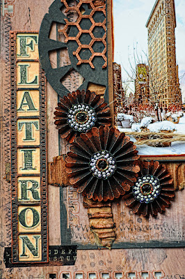
Happy New Year!!! Welcome to my  first round of Blue Fern Studios Design Team projects for 2014. With winter in full swing in some parts of the country, it made me think about our trips into the city on snowy days. New York City that is. One of the most fascinating iconic treasures is The Flat Iron Building. If you've never been, it sure is one of the buildings you have to visit. I chose to use one of my favorite winter pictures of the building for this layout and do it in a more grungy style.

 To keep in the chipboard theme, I used 2 pieces of Kraft paper to complete this layout. Gesso, paint, stamping and embossing round it all out in techniques. I even used some washi tape!! And I channeled my very talented friend Heather Jacob while I was creating this layout. you can see so many beautiful Heather touches here. I absolutely love her style and thought it was perfect for this layout!.


The Manor Hinge was painted with black acrylic paint then kissed with Viva Colour Metallic rub in Copper. I used the rub on the nailhead brads as well. 


I used  a piece from the Film Strips pack to display the title of my layout. The Bits Of Honey pieces were rubbed with the bronze metallic rub as well. They look like actual metal pieces.The Rosettes were die cut from my Tim Holtz Alterations Die. I rubbed the edges with The Viva Colour Bronzze Metallic rub before accordian folding and putting together.


I die cut some Tim Holtz Alterations tags and then used an embossing folder to make them look like they were cut from scrap metal. I used distress stain on them and lightly touched the edges and raised parts with black distress paint.

Here is a closeup of the magnificent building. And if you have never heard of it, read about it HERE. Fascinating... I used the Tim Holtz Alterations Pediments die to top the photo.


This next project is another entry into my art journal. I think the  Winter Page Dangles fit perfectly in my journal as they were the perfect size.  I followed the sketch from our January Sketch Challenge. I hope you join in and create something with the sketch.

http://bluefernstudios.blogspot.com/2014/01/january-sketch-challenge.html


The Blue Fern Studios Shabby Snowflakes were coated with Glitter then topped with a pink rhinestone to enhance the color of the rose in the photo. It adds just a touch of warmth.


The Winter Page Dangles were painted and then covered with a thick Lacquer medium and sprinkled with glitter. The lacquer is dimensional makes them look like jewels.  Rhinestones were also attached to the page dangles.


 This last layout is a redo of an older layout I had stashed in my pile of layouts. Long ago, I had created some rolled roses for this page and attached some store bought butterflies. It needed a serious wonderful new facelift, so I pulled off the flowers and butterflies, picked out my Blue Fern Studios chipboard and created my redo. I love it even better than the old version. It is bright and cheery and makes me think of a summer garden.


The Fantasy Butterfly set has the most beautiful pattern in the wings. Open and lacy and perfect for this frilly page. I used a Splash Of color Viva Colour Pearl Pen  in Black for the body and antennae, then painted the wings with acrylic paint in white, and spread Silks Acrylic Glaze in Plumeria over that when it dried and sprinkled some iridescent glitter on while the glaze was still wet. The photo needed some corner adornments so I used 2 of the Small Symphony corners that I painted with Splash of Color Luminarte Acrylic Glaze in Pomegranite and then rubbed Violet Splash Of Color Viva Colour Inka Gold metallic rub on lightly for added shine.


 I replaced all of the big flowers on the layout but kept the large brown one underneath.

 I just adore the small Symphony Corners. They add an elegant touch to photo's.


Thank you for stopping by for some inspiration. I hope you join our Blue Fern Studios January Sketch Challenge. There is an awesome prize to be won!!! Till next time, Happy New Year!! May the new year bring you wonderful creativity!!